

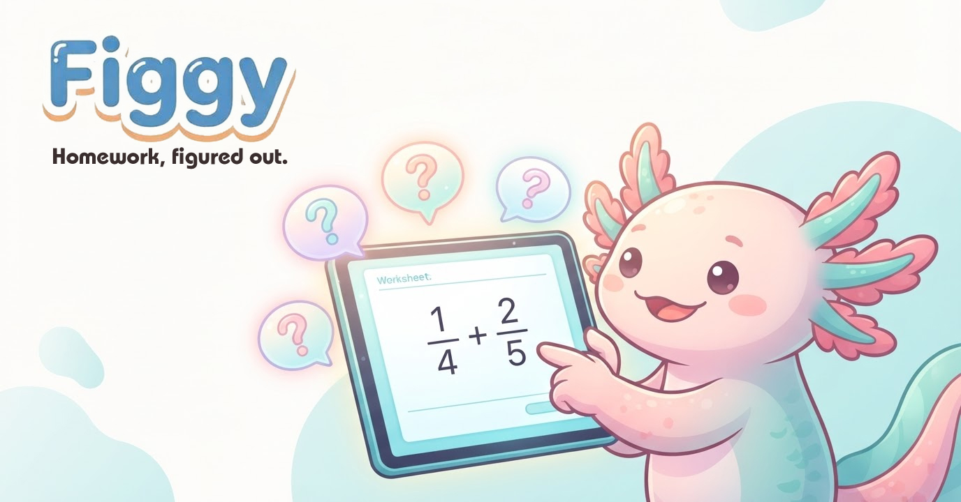
Every parent knows the nightly homework struggle. Somewhere between "I don't get it" and "just tell me the answer," kids stop trying to figure things out and start trying to survive. When I set out to build a solution to that problem, I wanted more than a tutoring app. I wanted something that helped kids figure it out themselves. That idea became Figgy, a homework helper for grades 4-8, now live at figgyfresh.com.
This is the story of how we took Figgy from a napkin sketch to a published product, and a look at the process we use at Artwurks Unlimited for every project, whether it's a brand identity, a website, or a full product.
Start with the kid, not the technology
Before a single screen was designed, we started with a simple question: who is this for? The answer shaped everything. Kids in grades 4-8 are at the age where confidence in school is won or lost, and where most homework help starts feeling like another adult lecturing them.
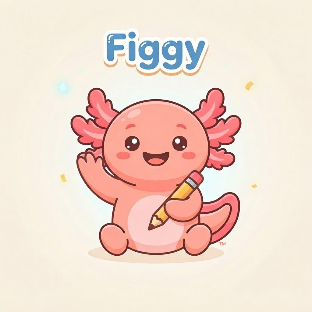
So Figgy needed a friend, not a tutor. We designed the mascot first: a round, huggable pink axolotl with big expressive eyes and a yellow pencil. Why an axolotl? It's one of the most beloved creatures of this age group, and it gave us a character that could be encouraging without being preachy. The visual style follows the same instinct: flat vector illustration, a soft cream background, warm pastels. It looks like a picture book, not a piece of software.
The brand does one job: make a stressed kid exhale.
A philosophy you can build into code
Most homework apps answer the question. Figgy refuses. Ask Figgy "what's 3/4 divided by 2/5" and you will not get a number. You'll get a friendly guide through it, one small step at a time, until the kid says the answer themselves.
That philosophy had to be engineered, not just written on a slide. When a kid says "I'm still stuck," Figgy doesn't cave and reveal the answer. It walks up a ladder of hints: first a gentle question, then a breakdown of the concept, and finally a fully worked example of a different problem with different numbers, so the child sees the pattern and applies it themselves. The answer is always the child's to give.
We built the same discipline into everything: no timers counting down, no auto-advancing lessons, feedback that treats mistakes as normal ("Mistakes help your brain grow"). A Sensory Comfort mode lets parents dial back animation, sound, and stimulation for kids who do better in a calmer environment. And for kids who read better with their ears, every question and hint can be read aloud.
Designed for the parent's peace of mind too
Kids use apps. Parents evaluate them. So Figgy collects almost nothing from children: a first name and a grade level, with parent-managed accounts throughout. The parent dashboard is a read-only peek at practice, showing what was worked on, where the child got stuck, and what they're building toward. No dark patterns, no engagement traps, no data mining. Just a tool that works and respects the family using it.
The Artwurks process, in one story
Figgy went from concept to live product in weeks because we ran it the same way we run every Artwurks project: AI-assisted, human-approved. AI tools moved fast on variations, mockups, video, and code scaffolding. But every asset, every line of guidance Figgy gives a child, and every pixel went through my review before it shipped. Speed from the machines, judgment from a human who cares about the result.
That's the same promise behind every logo, brochure, website, and campaign we deliver.
Try Figgy (and tell us what you think)
Figgy is live now at figgyfresh.com. We're currently running a free pilot for a small group of families with kids in grades 4-8. If that's you, we'd love your honest feedback: what works, what's confusing, what you wish existed. Pilot families get our thanks, our ear, and a head start on something we think is special.
